How to create a “Before & After” image slider with CSS and JS
A step by step tutorial for creating a before and after image comparison effect using html range input
Content
- Introduction
- Result demo
- Prerequisite
- Step by step guide
- Conclusion
Introduction
If you have two images for comparison, one effective, and yet simple UI element is the “before and after” image slider.
This “slider” element allows your user to control how the two image display on the screen, and freely explore the two different images. You might think it requires some library to create such an effect, but actually, it is a very straight forward and easy to code UI. With basic knowledge in CSS and JS, everyone could create it.
In this tutorial, I will explain in detail the concept behind this UI, how do you implement it, and suggestions for further enhancement. Let’s start coding.
Result Demo

Codepen demo: https://codepen.io/josephwong2004/pen/NWRGxdR
(Best view in viewport > 900px)
Prerequisite
- Basic HTML, CSS, and JS knowledge
- (Optional) SCSS and JQuery for convenience, but you can achieve the same result without it
Step by step guide
Step 1. Understand the concept
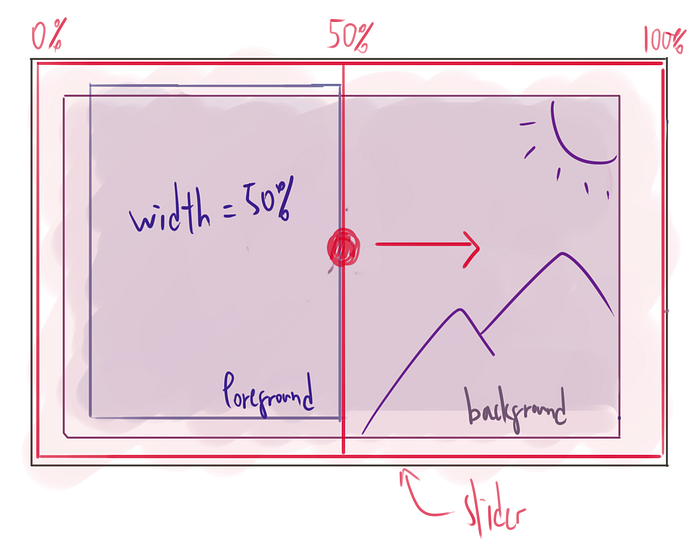
The concept of this “image slider” is very simple. You only need two components, the image container, and a slider.
The image container is just a regular div, with two images of the same size overlapping each other. One as the“background”, another as the “foreground”.

We will use absolute position to make the foreground image directly on top of the background one. The background image always has 100% width, while the width of the foreground image would change according to user input, making part of the background image appear.
The second component is the “slider”. To make thing simple, we could just make use of the html “range” input element. It allow user to select a value by dragging, between your defined min and max value. The input could be easily retrieved using an event listener in javascript.
<input type="range" min="1" max="100" value="50" class="slider" id="myRange">
One drawback of using the default slider input is, the styling of it is kind of limited. You cannot go very crazy on the design. If you are looking for a more customisable slider, you might have to build it yourself. However, it is not a focus of this tutorial.
We would make the slider with 100% width and height of the container, and position it on top of the image container. When the user drags the slider, we update the width of the foreground at the same time. Creating an illusion of the user is dragging the image instead.
I hope that’s enough explanation. We will jump into the coding now.
Step 2. Create the image container
Let start by creating our container. It is a simple structure with two div inside. Since we don’t want our image to scale based on the div width containing them, we will use apply the image with background-image instead of <img> tag. One important style we need to use is the background-size property, and make sure that the image always stays at the same size.
HTML:
SCSS:
To make thing a little bit easier for this tutorial, I used fixed size for everything.
*If you don’t want to use SCSS, just make the style flat instead of nested
Now we have our container, let’s add the slider.
Step 3. Create the slider
Our slider needs to cover the whole image, with a thin white bar “dividing” the before and after part of the image. It could be done by styling the slider and the slider-thumb (the part where you drag). we need to make the default appearance of the slider and the thumb invisible, and then apply our own style on it.
HTML (below the images):
SCSS (with reference to https://www.w3schools.com/howto/howto_js_rangeslider.asp):
If you don’t want to use SCSS, replace
@include centerwith the content in@mixin center, and use.slider::-webkit-slider-thumbto replace the & syntax
I applied a slightly visible grey color background to the slider, and on hover, making the color even more transparent. Creating a “focus” effect when user hover over the image. For the slider-thumb, it is just a white background div with full height of the container.
You might need ::-moz-range-thumb for browser support in firefox
We now have a working slider, let link that up with the width of the foreground image.
Step 4. Add event listener to the slider
The last step is to link up the value from the slider to the width of the foreground image. It is very easy to achieve (since we are using the native html range input as the slider). We could get a value from 1–100 in the event.target.value when we apply event listener.
Then, we just need to select the foreground element, and change the width of it whenever the slider got updated.
JS:
If it didn’t work as expected, try to see if you retrieve the value of the slider correctly, and double check the background-size property of your css
Yeah! The function is working. As a bonus of using the range input, we can even click within the container to make the slider go to the clicked position.
One more thing we could (and probably should) add to the UI is a “drag me” circle icon on the slider, as an indicator that this is a drag-able component.
Step 5 (Optional). Adding a circle thumb on the slider
The native range input has it advantage (easy to implement, easy to retrieve value, etc), but when come to styling, there are not much we could do. As we replace the default “circle” thumb with our white-separating line, we need to add the circle back somehow.
A quick (but dirty) way to do it is to add another element, completely not related to the slider, but is positioned to the center of it, and would “follow” its movement by javascript. And this is exactly what we would do.
HTML:
SCSS:
The after and before element add the two “arrow” inside the circle button
JS:
One more thing we need to do is to make the circle not selectable, so the mouse event always goes to the slider. With some careful positioning and JS, we make the circle thumb move together with the slider.
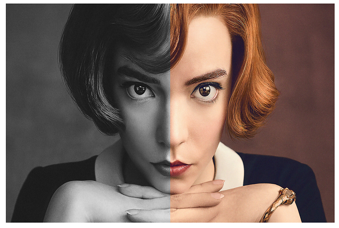
And with that, our “before and after” image slider is completed. You can now pick your favourite image and experiment with it. (And thank you Beth Harmon for accompany us through this journey)
Conclusion
As promised, the concept of this UI element is very simple. You don’t need to install another library just for this effect. That being said, it is a very basic implementation, as you can see I used a lot of fixed pixel size. If you are going for a more “production-like” design, I suggest to spend sometime investigate how the design change on different window size.
In this example, I used black and white picture and color picture comparison. But I see a lot of other example featuring change of time (such as the same city 100 years ago and present). For those kind of design, you can also add a following tag showing the current years (similar to how we add the slider button).
Also, since we are using a background image property (which is not affected by container size), you could also use an animated gif to create a static to moving slider easily.
If you like this tutorial or have other ideas, feel free to leave a comment!
Level Up Coding
Thanks for being a part of our community! Subscribe to our YouTube channel or join the Skilled.dev coding interview course.

